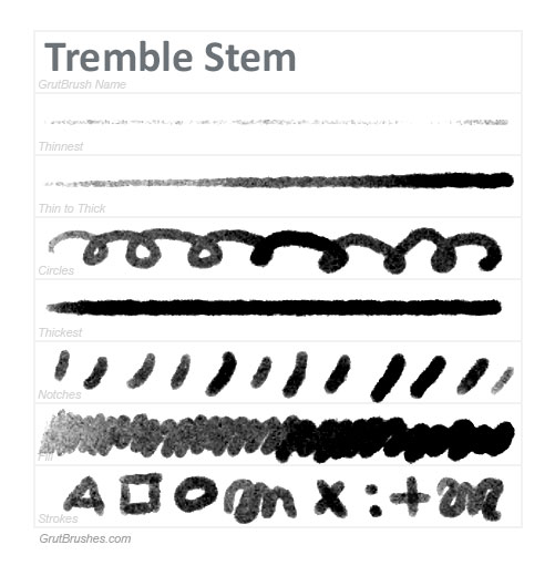
This is two previews in one; sample brush strokes of Tremble Stem, a Photoshop Ink brush I’m working on that should be in the shop soon but also a preview of a new brush stroke sampler template. I want to develop a standard set of sample strokes that will both show off the brush in action and at the same time enable you to compare them in a relatively standard fashion. I’ve borrowed a template style from the excellent reviews of brush pens that I really enjoyed on Parkablogs written by Teoh Yi Chie. By performing a similar set of strokes using each brush I hope to be able to give a good idea of how each GrutBrush performs so that you can pick the perfect brush for your digital painting or drawing. This is just the first draft, based on Chie’s samples and it will probably change before I implement it widely.
It currently consists of the following brush strokes: one line of the thinnest stroke the brush is capable of, a line of the brush going from thinnest to thickest. Next, a row of circles, to show how the brush behaves on curves and also how the brush behaves when changing direction, including how the texture reacts to stylus direction (if at all) Drawing circles also introduces slight random variations in pressure simply by the fact that it’s difficult if not impossible to keep a consistent pressure on the stylus when drawing in a circle.
The next line is the brush stroke when a constant maximum or close to maximum pressure is applied. Then a row of ‘notches’ or pen flicks followed by a row of plain old ‘colouring in’ again, going from lighter to darker. The final row I have here is what the brush strokes look like when drawing shapes, similar to characters as well as dots, squiggles and at least one set of lines that cross each other.
These line samples all work well here as this is a brush that is very much like a brush pen, it’s width,opacity and texture all vary according to how hard you push on the stylus or pen, but how useful will this sample chart be on a brush where the pressure makes no difference? three of the rows will be virtually identical. What to do then? Make several different chart types? Doesn’t that defeat the purpose of having a standarised test? All that will have to be worked out, but I like the idea and I think it can be a very useful tool in comparing and picking the best Photoshop brush for the task at hand.
